4 reasons why feedback data + operational data = better data storytelling
Table of Contents
“How do you know that to be true if you only hear half the story?” Sound familiar? It’s an age-old saying but when it comes to data analysis, you and your team could tell a much richer and more nuanced story if they’re analyzing data that’s well rounded and comprehensive.
According to an article by Deloitte, organizations that combine customer experience (CX) feedback with operational data into what it calls “OpCX” could help them better build loyalty and drive growth. “By breaking down data silos across the organization and allowing for the use of advanced analytics tools, AI, and machine learning [OpCX] can connect, enrich, and contextualize CX and operational data sets that are not normally paired. In doing so, the framework can uncover insights, make recommendations, and improve CX at scale.”
For example, if you’re leading a customer experience (CX) initiative, you could analyze all types of data that customers generate, including survey feedback and transactional data in one place. What you’d get back would be richer insights that can help in varying areas of a business, from measuring branch performance to tracking Net Promoter Score® (NPS®). With that rich data, you could create more compelling data stories to present to your executives to secure their buy-in for additional CX initiatives.
And, this isn’t limited to CX. Connecting existing operational data with real-time feedback from prospects, customers, and employees can provide deeper analytics necessary to fuel positive, growth-oriented business outcomes. Your analysts can dig deeper to identify opportunities and potentially eliminate gaps that would otherwise go unnoticed. Imagine the improvement initiatives you could create by having those rich insights at your fingertips. In addition, with the right technology investments, organizations can achieve a centralized view of their data to measure, benchmark, and act upon, quickly.
Read on to discover 4 reasons why integrating feedback data with other business data yields richer analytics for business growth.
NPS, Net Promoter & Net Promoter Score are registered trademarks of Satmetrix Systems, Inc., Bain & Company and Fred Reichheld.

Uncover actionable insights, faster
Unlocking the why behind your data shouldn’t feel like a backyard treasure hunt. With data visualization tools you can accelerate the decision-making process, especially when it comes to making sense of your survey data. With features like customized dashboards, you get quick visuals for faster decision making and less churn. And that means your teams can take immediate action with quick reads into trends and patterns versus participating in long meetings to understand the data.
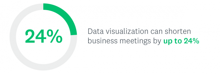
Source: American Management Association® | Using Visual Language to Create the Case for Change
Data visualization can help provide insights on important connections as they occur between business operations, performance, and customer sentiment. For example, as a marketer, you might get information sooner about a particular product or campaign not performing well. Armed with that knowledge, you can quickly make improvements.
Businesses that McKinsey found to be high achievers at analytics spent more than 25% of their IT budgets on analytics. Maximize that spend by giving your analysts the combination of feedback and other business data to analyze. With that data, you’ll deliver better actionable insights for teams to drive improvements.

More holistic data = more thoughtful initiatives
It’s clear, the need for more comprehensive data is top of mind, especially for mid-market and large enterprises. Research from the Dresner Advisory Associates’ 2020 Data Pipelines Market Study found that 67% of enterprises currently rely on data integration to support analytics and BI platforms, and 24% are planning to in the next 12 months.
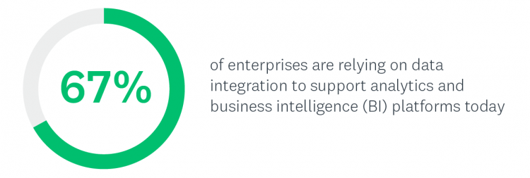
Source: Forbes | The State Of Enterprise Data Integration, 2020
Connecting feedback data with operational data can empower your analysts to dig deeper—whether you want to identify new sales opportunities, share out market insights, or evaluate trends in employee engagement. That's where data visualization tools can help, offering more engaging data views through visuals and customized dashboards. You can enable users to:
- analyze responses and compare to past datasets
- create more attractive visuals for sharing responses
- pair responses with pre-existing operational data
- share data models, charts, graphs, and reports
With more engaging and comprehensive data, teams are better set up to identify opportunities and map strategies back to revenue to build a business case or show ROI.

Get more context from your data
For businesses to enrich the analytics of their data, like customer feedback for instance, data visualization tools are key in making new connections as they occur between business operations, performance, and customer sentiment.
For example, Chase Zenger, Head of Customer Experience and Advocacy at Box, explains how he needed to identify the key “moments of truth” within the customer journey. Previously, Zenger and his team had mapped out, in detail, the entire customer journey for different personas, segments, and use cases. It was valuable, but didn’t give leadership the actionable insights he needed.
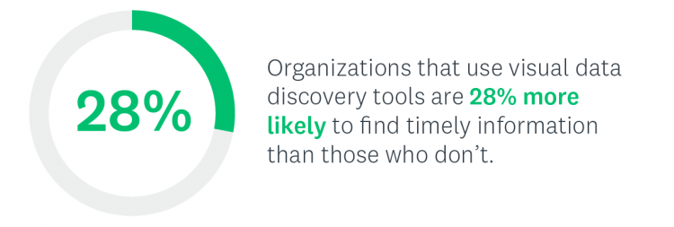
Source: Readwrite | The Business Benefits of Visualizing Your Data
The solution? Zenger and his team ended up aggregating their survey data in a data visualization tool. Combining that feedback data with operational data helps Box maintain a rich view of customer health, see how they’re doing, and understand whether there are areas they need to focus on. Read more about Zenger’s approach.

Create a central view for better collaboration
When you connect diverse data types, the opportunities to drive valuable business change increase. That’s why getting the entire picture is essential to capture different perspectives and integrate them. For example, when organizations integrate CX with operational data, the result is a more comprehensive range of data. Businesses who aren’t considering customer and employee feedback as part of their greater analysis strategy risk missing important aspects of their data story.
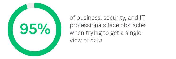
Source: PR Newswire | Survey Reveals Most Organizations Struggle to Extract Value from Operational Data
Similarly, a unified source for customer information can serve as a building block for success and provide a better customer experience. In order to position survey data as a valuable asset—you must be able to share and integrate it across applications, groups, and departments in your organization.
When you connect survey data to analytics tools, you also create more opportunities for collaboration. Meaningful charts and graphs can help foster clearer communications across teams, producing greater business insights. Erin Pinkus, Senior Research Scientist at SurveyMonkey notes, “everyone needs to communicate with each other early on, especially if the person writing the survey is not the person analyzing the data. Communication as a team throughout the lifecycle is key.”
Key takeaways
There’s a lot to be gained from connecting customer insights to your operational data.
It’s also important that other departments and stakeholders are onboard, notability the C-suite and executives, whose opinions have a great deal of influence on an organization.
For analysts to tell a more robust and powerful story and support key players within an organization, businesses need more comprehensive data, period. From driving business change to increasing revenue, enriching data by combining feedback data with operational data can drive valuable insights to better inform decision-making.
The result? More customer-centric, strategic, and thoughtful initiatives to drive innovation and fuel business growth across an organization.
Get the most out of your survey platform
See how SurveyMonkey Enterprise helps organizations securely collect, share, and collaborate over data to gain insights that make an impact. Combine survey data with data you already have using integrations and APIs including Microsoft Power BI, Tableau, and more.
Ready to learn more? Contact us today

