Let’s put on our survey design caps, shall we?
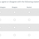
When you want to ask many questions in a row that have the same response options, you’re most likely going to turn to the mighty matrix question.
This question format places similar questions in a single grid instead of presenting them one by one, like the following:

This type of question can help keep your survey short and easy to take, but it’s also easy to build one that's too long.
So what’s the right size of a matrix question? How many options is too many, and how should you organize matrix questions when you have, well, a lot of questions?
It’s good to limit your matrix questions to the minimum so as not to overwhelm yourself with the amount of data to analyze. It’s also important to think about your respondents’ experience when taking the survey. And don’t worry, we investigated just that in a recent study.
Ready to start building matrix questions?
Matrix questions can help you collect more valuable responses—no matter the type of survey you run.
How do you determine the best matrix size?
To really get data on the best way to design matrix questions, we ran an experiment on different matrix sizes to look at how the layout affected responses and participant experience.
We asked the same 20 questions on an agree-disagree scale to over 2,000 respondents via SurveyMonkey Audience. Some people had only 3 response options, some had 5, and some had 7.
Additionally, some saw questions with a maximum of 5 rows a page (meaning they had 4 pages for the 20 questions), some had 10 rows (2 pages with 10 questions per page), and some had 20 rows (all 20 questions on one page). By survey’s end, all respondents were asked to rate the survey’s layout and difficulty.
Some of the outcomes we looked at were:
- Completion rate
- Completion time
- Ratings of the survey layout, difficulty
- *Response consistency
Response consistency looks at how each person’s responses were consistent with their other responses. In other words, if a person agrees with a statement at one point, they should generally agree with a similar one later, and disagree with an opposite of the statement.
What did we learn?
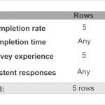
Even though everyone had the same questions, the layout had a big effect on some of our outcomes. In particular, when there was a smaller matrix with only 5 rows on a page, as compared to larger matrix with 10 or 20 rows, people dropped out less and rated the survey as easier to take. There were no differences in reliability or completion time.
The results were clear—fewer is better! Even though they had to scroll through more pages, it was better and easier than having to look at a massive, 20-row matrix on a page, without any additional costs of time or consistency.

How about columns? This one will depend more on what your question is. In general, it’s a good idea to use columns at a minimum depending on your data. In this survey, people in the 7 column condition took longer to complete.
However, those in the 3 column version gave slightly less consistent responses, perhaps because they didn’t have as much room to give the responses that was more accurate for them.
What’s the final recommendation?
Based on this study, we had a clear winner on the best size for a matrix question—5 rows by 5 columns.

Now, this will of course depend on the exact number of questions you need and what kind of response options you have, but your best bet is again, go small.
Keep your matrix to no more than 5 rows per page, and your response options to the lowest necessary to get reasonable answers.
Most importantly, always think of the respondents’ experience when creating your survey. Put yourself in their shoes—would you want to wade through giant matrix questions while trying to complete a survey?
Get the highest quality data that you can and by designing your survey with these kinds of tips and more in mind will help you do just that.


