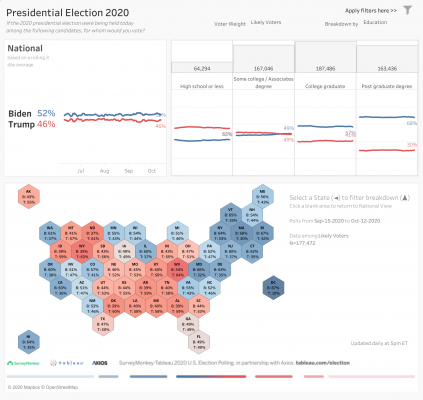
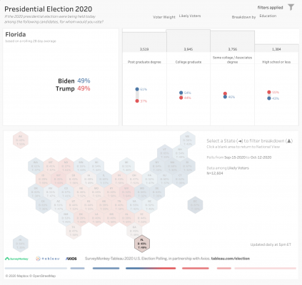
With three weeks to go before the polls close on November 3, SurveyMonkey is rapidly approaching one million total respondents surveyed as part of our election partnership with Tableau and Axios. And we’re doing something unconventional this year: instead of releasing a single spot poll or a series of polls, as of today we’re publishing daily data as they come in. Not only that, through our partnership with Tableau we’re also giving you—and everyone else—powerful tools to analyze the results, investigate voter groups in fine detail, and if you so choose, make your own predictions for what’s widely understood to be a critically important election.
The updated U.S. presidential election dashboard provides unmatched access to the voter preferences driving the campaign’s final twists and turns. To help you make sense of the data, I’m providing a little background and a bit of a “how to” on using the dashboard below.
What makes our dashboards different
Typical poll analysis stops at the topline numbers—who’s ahead and by how much? Other times, people pore over limited breakdowns about the types of voters leaning one way or the other. Because of our vast scale, we can do things differently at SurveyMonkey. With the amount of data we’re collecting from our “river sample,” we are able to showcase full trends by voter characteristics at the national level, and crosstabs that show the relationship between two or more variables for all 50 states (and D.C.). We also have rolling estimates of irregularly surveyed characteristics, including gun ownership, union membership, veteran status, and sexual orientation.
By the way, your company can tap into this giant sample for market research, concept testing, and more.
How to use the dashboards
The revamped dashboard shows three-day rolling averages of the national vote choice between President Trump and former Vice President Biden--the latest “snapshot in time” at the national level, at least until the next day’s data refresh, giving you the option of using either registered voter or likely voter weights (more on that below).

Click the filter icon (in the upper right corner) to see any of these breakdowns for segments of voters not available in the curated views. This allows you to explore crucial intersections of voter characteristics. If any combination of voter characteristics have fewer than 50 respondents, no data will show for that group.
Next to the national trend, you can see the trended breakdown of the vote choice by demographic and other groups, where sample size allows.
Clicking on any state in the map will bring up demographic and other group breakdowns for that state in the upper right viz, replacing the national breakdowns. The data for each state are weighted individually and are from the last 28 days, again updated daily.

Why 28-days? Our aim here is to allow deeper exploration of the voters who are picking the next president, not attempting closest-to-the-pin prediction. To really focus on the voters and the crucial intersections (e.g. race by age by gender) requires a lot of data, and to do this at the state level we present a four-week roll-up. In addition, for all the back-and-forth of the campaign, the presidential contest has been relatively stable. Over the final stretch we will release results for shorter time periods when sample size allows.
(If you’re looking for sites to offer forecasts, see FiveThirtyEight and the newer effort from the Economist... although if you’ve read this far you likely already know those well.)
To dig into voter characteristics more deeply, including size of electorate information, click on this Interactive Demographics dashboard (this dashboard will also be updated daily beginning today).
How we built it
Respondents for all of our public opinion polling are selected at random from the more than 2 million people who take surveys on the SurveyMonkey platform each day. All demographic and other information is provided by the respondents, and data have been weighted for age, race, sex, education, and geography using the Census Bureau’s American Community Survey to reflect the demographic composition at the national or state level. The registered voter data is filtered to those who indicate that they’re registered to vote at their current address.
To compute likely voter weights, we generate predicted probabilities of voting for each survey respondent, using insight from validated voter studies from the Cooperative Congressional Election Study and the Pew Research Center. The model takes into account a combination of demographic variables including race, age, gender, education, party identification, along with respondents’ stated intention to vote, voter registration, and vote history.
The likely voter modeling is among the changes we’ve made since 2016. Four years ago, our polls showed Trump's outsized support in the industrial Midwest, but we also were roughly two points more off-the-mark on the margin than some other polls elsewhere. Without going too far down the rabbit-hole, we’ve added more granularity to the way we weight by education, a simple, straightforward adjustment that would have corrected most of the 2016 error.
At the end of the day, I encourage you to dive in, and explore the data for yourself. Thanks to SurveyMonkey’s vast scale and the power of Tableau’s visual data storytelling tools, we can examine the preferences of voters from all different backgrounds in typically unavailable combinations. What story will the data tell in 2020? See for yourself here.
If you’re inspired by what you see, here are a few tools to get you started on a SurveyMonkey-Tableau masterpiece of your own:


