Last month, we gave you Basic Statistics so you can see the mean, median, mode, minimum, and maximum alongside your survey results in an instant.
Today, we want to show you SurveyMonkey's newest feature, Statistical Significance, where we do the advanced math for you to help you understand whether or not the results you’re getting are statistically significant.
What is statistical significance? A statistical significance tells you whether one group’s answers are substantially different from another group by using a statistical formula. If something is statistically significant, that means the numbers are reliably different, which is very helpful when you want to see if two percentages are actually different given the sample size (check out our sample size calculator) of each group.
In other words, based on the level of statistical significance you see, it means your results are either closer or further from the truth. (“Significance” here doesn’t mean “important.” It means “probably true” and not due to chance.)
How Statistical Significance works
The Statistical Significance feature works in combination with our Compare feature. When you apply a Compare rule, if you show Statistical Significance, we will display new information right in your data table.
You can turn on the setting to show Statistical Significance when you create your Compare rule. Just select your answer options to compare, then set the Show Statistical Significance switch to On:

You can also switch the feature on and off by going to Customize on your chart, clicking the Display Options tab, and using the Statistical Significance checkbox:

When you look at your results (in the Summary tab), you will notice some new information in the data tables. For example, here’s a data table where we’ve compared the answers to “Do you plan to use our product more or less in the next 12 months?” with the answers to “How long have you used the product?”
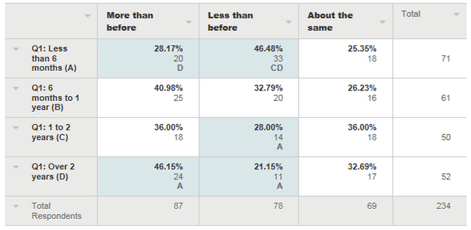
You can see right away that we’ve highlighted several of the cells in the table. These are the cells that have statistically significant differences. The letters in the cells tell you from which cells they are significantly different. (We added letters to the group labels in the left column, so you can tell which letter applies to which group.)
So, in this example, you can see that your new users (less than 6 months) and your oldest users (over 2 years) answered “More than before” at a significantly different rate.
In the case of the answer option “Less than before,” you can see there is a statistical significance between the new user group and both the 1-to-2 years and the over 2 years groups.
If you roll over the cells, you will get more detail on the statistical significance:

But what does this tell me?
The shading will help you come to the conclusion that more veteran users are more likely than newbie users to increase their usage of your product. Even though the percentages are different from one another—because the boxes for the two middle groups (6 months to 1 year, 1 to 2 years) aren’t shaded (indicating that they aren’t statistically different from any group)—you can be fairly confident that they aren’t any less likely than the seasoned vets to increase their usage of your product.
While Statistical Significance can tell you what is statistically different, it does not necessarily mean that the difference is meaningful. It’s up to you as the interpreter of the results in Analyze to determine if that statistical significance is important.
Running an AB test? Calculate the statistical significance of your results in seconds with our AB Testing Calculator!
Putting it all together
Now you have all the tools to find out exactly what you need to know about your audience.
If you ask the right questions, get enough responses (SurveyMonkey Audience can help you with that) and then create Compare rules and show Statistical Significance, you can find out:
- How your varying market segments or demographic groups act differently
- What really matters to each of your segments
- How to target each segment specifically
- And much, much more…
Note: The Statistical Significance feature is available with certain paid plans. Have questions for our survey pros? Let us know in the Comments!