If you’re a regular blog reader (THANKS), you might remember from our post last week that we ran an experiment on the different progress bar choices offered in SurveyMonkey. We wanted to answer the following questions:
- Should you put the progress bar at the top of the page or the bottom?
- Should you display the page number or the percent completed or just the bar itself?
- Should you use a progress bar at all?
The Bet
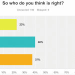
First things first—who did you think won? Of the nearly 200 people who cast their survey votes, most thought that Nick was wrong but were torn between Mingnan and Laura’s arguments.

Our results will show that they were on the right track! Let’s dig into the experiment.
The Experiment
We randomly assigned respondents from SurveyMonkey Audience to one of 7 experimental conditions in either a short or long version of a survey in order to test different ways to present progress bars.

The short surveys were all 8 pages and asked the same 17 questions in the same order—the only difference between them was the placement and type of progress bar. The long surveys were all 18 pages and asked the same 33 questions in the same order—again, the only difference between them was the placement and type of progress bar. Both the short and long versions included one survey that had no progress bar at all to serve as a control.
We received more than 350 responses to each version of the survey, and no respondent completed more than one version.
Once we had our results, we compared the completion rates for each of the different surveys with various progress bars to the two control groups without progress bars. Here, we define the completion rate as the number of respondents who completed the survey divided by the number of respondents who made it through the first page of the survey.
The goal of including a progress bar is to help keep completion rates high as respondents move from page to page. As the thinking goes, people who are reassured that they’re making progress will stay motivated to keep clicking through to complete the survey. Let’s see if that actually turns out to be true.
The Results
Let’s start with our control groups. The two surveys with no progress bars had about equal completion rates: 87% for the short survey and 89% for the long survey. Any surveys with higher completion rates can be said to perform better than the control. Surveys with lower completion rates perform worse than having no progress bar at all.
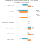
In both the short and long versions of the survey, including a progress bar at the top of the page did exactly that. For both the short and long surveys, including a progress bar at the top with the percent complete reduced the completion rates compared to surveys without any progress bar.
Surveys with a progress bar on the top as a visual scale or with the number of pages completed had mixed results: the addition of progress bars helped the completion rate in some cases but hurt it in others.

More positive results came from moving the progress bar to the bottom of the page. Except for the condition with the progress bar and page number in the long survey, all other types of progress bars shown at the bottom of the page improved the completion rate relative to surveys with no progress bars. The bottom progress bars with visual scales showed the most consistently positive results.
What does this mean for you?
Granted, these are small differences of only a few percentage points, but every little bit counts when keeping your completion rates high and minimizing bias. We looked at every possible comparison of progress bar placement (or no progress bar at all) for both the short and long surveys. All in all, our results indicate two things:
- Progress bars should go at the bottom—not the top!—of each page of the survey.
- The visual scale displayed alone–without page numbers or percent complete–is best.
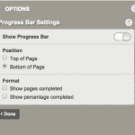
The default setting in SurveyMonkey has always been to have the progress bars turned Off, and we’re going to keep it that way. But, if you do decide to use a progress bar in your survey, you should put it at the bottom of the page instead of the top. As of this week, if you add a progress bar in SurveyMonkey, we’ll automatically put it at the bottom of the page (though you can always change that to move it to the top of the page if you want).

So, there you have it. Did you ever think so much thought would go into something as simple as a progress bar? Our research team thinks about this stuff all the time. If you have any ideas for future survey research topics, leave them in the Comments below!
Oh, and about that bet between Mingnan, Nick, and Laura… since Nick lost the bet he had to come up with a joke.
Knock knock.
Who’s there?
You.
You who?
You should really put a progress bar at the bottom of the page.
Questions? Have an even better knock-knock joke to share? Leave it below (we clearly could use knock-knock joke help).


