A matrix question—or really, multiple questions presented on a grid—is one of the most popular question types in online and traditional pen-and-paper surveys.
For survey creators, these bundled questions are easy to write and program. For respondents, they’re generally easy to interpret (and answer) since the scales and answer options stay the same across all items.
However, the surface simplicity of this question type masks significant downsides. In order to collect high-quality data, you want to be aware of some of this question type’s primary pitfalls, especially since taking surveys on mobile devices continues to be on the rise.
Since matrix questions are so easy to create, question writers often overuse this question type. They offer too many response options and too many items or rows. This makes it difficult for people to read and can encourage poor survey taking behavior, like straight-lining (where respondents select the same response for each item without careful consideration of each row) or randomly selecting responses because they just want to escape the matrix!
Tips for making sure you don’t get caught in the matrix
Ready to take a look at some example matrix questions? We thought so! Imagine you run a clothing store in a mall. And you’ve written a customer satisfaction survey, which you send out to everybody who’s purchased something from you in the past week. Here’s your first question:

At first glance this question doesn’t seem so bad, but there are a few things you can do to immediately improve this matrix question. First, make the response options briefer by removing the unnecessary N/A and also the numbers.
So if you’d like to use numbers in your analysis, try the “use weights” option when you are creating your survey. That way your survey won’t be cluttered and you can still find the average rating in Analyze:

4 quick tips for writing good matrix questions
- Keep response options short (response options are the columns of possible responses)
- Try to display only 5 or fewer response options
- Keep the item wording short (items are the rows)
- Again, try to display only 5 or fewer items
Don’t worry if your matrix question doesn’t satisfy the guidelines above, you can still use the questions you’ve written. In fact the example we gave doesn’t exactly abide by those rules either. You can improve the experience for your respondents and get better data by doing one of two things: either breaking up your matrix into individual questions or breaking up your large matrix into several smaller matrixes.
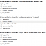
Here’s a look at the individual question format:

And a peek at smaller matrixes:

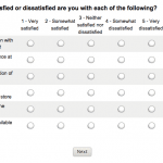
Another thing to keep in mind: mobile devices. We’ve talked a lot about them recently, because we’ve observed more and more people are responding to surveys using a smartphone or tablet. The horizontal formatting of matrix questions isn’t ideal for smartphones. Take a look at the matrix question from our customer satisfaction survey above on a mobile device:

In a word—yikes. If you do think that most of your responses are going to come from mobile respondents, regardless of the size of the matrix, you may want to consider not using that question type and breaking them out into individual questions. At the very least, test to see if the matrix question looks okay on your mobile device and check to see if the buttons are easy for people to click or tap. Here’s our suggestion:

There you have it, matrix fans. Don’t worry about getting stuck in the matrix, we’ve got you covered.


